Many people have discovered how easy it is to use Canva and similar online document design tools (such as PosterMyWall and Piktochart, both of which I’ve seen examples of recently, though this is likely a non-exhaustive list) to create posters, flyers, newsletters, reports, and other such documents for distribution around campus.
Unfortunately, these tools tend not to handle accessibility very well, if at all. They may be acceptable for creating posters and flyers that are going to be printed and posted around campus, but if you’re planning on sending something out via email or posting it to a departmental website, these currently aren’t the best tools to use.
Executive Summary or Elevator Pitch
Canva and similar online document creation tools produce inaccessible PDF files. While they can still be useful for creating smaller single-page graphics to be used in email marketing or print-only flyers, they are not recommended for more complex multi-page PDF documents being distributed electronically. I recommend using Word and its accessibility features (or, if you have the knowledge, Adobe InDesign) to create documents being distributed electronically.
Accessibility…or the lack thereof.
The major issue is that Canva and similar tools, while great for creating eye-catching documents, pay little (if any) attention to the accessibility of the documents they generate. I’ve seen numerous flyers, newsletters, and reports sent out to the campus community that are entirely inaccessible to users who depend on assistive technology, and quite often, I find that they were created using one of these tools.
What do they do wrong?
Most documents created by these tools are not set up so that they can be read by assistive technology. At their worst, assistive technology will simply see a blank document. Even at their best, when the text can be read, it’s often read out of order, bouncing back and forth around the page, with any included images missing alt text, leaving the content of those images effectively invisible.
Does that mean we can’t use Canva (etc.)?
Not necessarily! There are times when Canva (etc.) will work just fine for your projects. However, you should consider the kind of project and how it will be distributed.
When Canva (etc.) works:
- If you are creating a poster or flyer that will only be printed, and will not be distributed electronically, that’s fine!
- You may still want to carefully consider the fonts and colors you choose, so that sighted people with colorblindness or other visual disabilities can read them, but otherwise, printed material should be fine.
- If you’re creating a small promo-style graphic that’s being used for social media or being sent out via email as a JPG, GIF, or PNG, that’s fine as well!
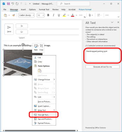
- You should make sure that the image has alt text defined in your email (in Outlook, right-click on the image, choose “View Alt Text…” from the menu, and then describe the content of the image in the box that appears) or in your social media post (X/Twitter and Facebook support alt text; Instagram does not), otherwise these images will again be “invisible”.

- If the image includes important information such as dates, times, and locations, I also recommend also including that information in the body of the email, so it can be read even if the image cannot be seen.
- You should make sure that the image has alt text defined in your email (in Outlook, right-click on the image, choose “View Alt Text…” from the menu, and then describe the content of the image in the box that appears) or in your social media post (X/Twitter and Facebook support alt text; Instagram does not), otherwise these images will again be “invisible”.
When Canva (etc.) does not work:
If the document is being distributed as a PDF file, especially if it’s a longer, multi-page document, or one using more complex formatting. This often includes informational flyers and posters, brochures, newsletters, and reports.
Because these kinds of documents have more text, more graphics, and more complex layouts (multiple columns, call-out boxes, etc.), they require more attention when being created to ensure that they are accessible to everyone who reads them.
But if you do use Canva…
Canva has started to introduce some features intended to improve the accessibility of the documents it creates. These are limited and are not yet capable of producing a fully accessible document. However, if you are using Canva, please keep these guidelines in mind:
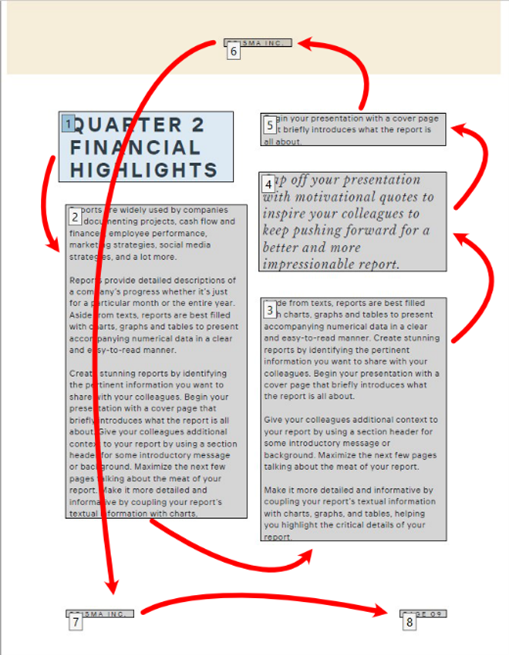
- Try to plan your document ahead of time so that you can add pieces (headlines, photos or artwork, articles, etc.) in the order they should be read. If you add a paragraph of text, then a photo, then the headline, then add another paragraph of text, that will be how the document is read – with the headline in the middle.
Canva currently does not support changing the order in which items are read, and even Canva’s own templates are often set up so that the page items are read out of order. I randomly chose an annual report template to check and found several issues, including one page that would be read down one column, up the second column, then the page header, then the page footer.

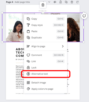
- Check all images (photos, artwork, graphics, graphs, etc.) to make sure they have alt text (right-click on the image and choose “Alternative text” from the menu). This includes any images that came by default if you use a Canva template.

- If the final document is going to be distributed widely (to all staff, all faculty, the entire campus community, the public, or any combination of the above), please feel free to get in touch with me (mhanscom@highline.edu) to perform an accessibility check before the document is sent out. Some of the above noted issues may be able to be corrected with Adobe Acrobat, and I’m happy to assist with this or provide training so that you can do the accessibility check yourself before distribution.
What alternatives are there?
If you are planning a document, especially one with multiple pages, a more complex layout, or that will be distributed as a PDF, I have some recommendations.
Microsoft Word
Microsoft Word can create very accessible documents. This does require a little bit of skill, but the basics are very easy to pick up, and I’m happy to meet with individuals or teams to go over them.
Very briefly:
- Use styles for headings instead of simply formatting lines of text.
- Use section breaks and columns instead of tables to create more complex layouts.
- Define alt text for images.
- Use Word’s accessibility checker to review documents as you work and before finalizing.
- Export using “Save as PDF”, do not print to PDF – or just send the Word document without converting to PDF at all.
Adobe InDesign
InDesign is the industry standard for creating accessible complex documents. However, it is also far more complicated and skill-intensive than Microsoft Word. If you have a background in document design, you may already be familiar with what InDesign can do.
If you are familiar with InDesign but aren’t sure how best to structure your documents for full accessibility, I’m happy to meet with you to go over the basics. If you do not already have familiarity with InDesign, be aware that it has a steep learning curve.
Other Possibilities
I do keep an eye out for other tools that can handle tasks like these. If I’ve convinced you to look at options other than Canva, but Word and InDesign don’t seem to be working for you, please get in touch with me (mhanscom@highline.edu)! I’d be happy to discuss any difficulties with you and see if there are other tools that might let you create the end result you’re looking for.
That’s it!
While I know that Canva (etc.) has many fans, and this may be a little disappointing, I appreciate your willingness to take accessibility into account when deciding on the best tool to use for a particular project.

